sears
Transforming the personal shopper experience
Overview
In 2009, Sears released a personal assistant app to expand mobile commerce strategy and provide customers with the ability to get shopping advice from a team of expert shoppers. This is my story of designing ‘Personal Shopper’—a mobile app that empowers relationships between the customers and their Personal Shoppers.
role
In 2015, I join the Personal Shopper team to lead the redesign of the iOS app and the new design for Android. The Project Manager, Product Manager and myself collaborated to ensure the Personal Shopper app for iOS and Android met customer expectations and scheduled deadlines. I led the efforts to evolve the program and address customer pain-points related to shopping experiences throughout 2015 to 2017. I was also responsible for the sketches, wireframes, interaction designs, visual designs and creating product specs for engineers
Categories
Mobile UX | P2P App | eCommerce | iOS
The challenge
Create deeper relationships between customers and their personal shoppers
When I joined the team in 2015, one of the biggest company goals was to build strong relationships with customers by personally serving them. That means efficiently determining what customers really want and then providing them with one-on-one human assistance. To make this a reality, Sears decided to create the Personal Shopper app and establish a network of Personal Shoppers across the country who are all about helping other people get what they want. Our challenge was to work with Customers and Personal Shoppers and evolve the app by identifying and eliminating friction points. Removing obstacles during the shopping experience created more space to innovate and perfect the connections between Customers and Personal Shoppers.
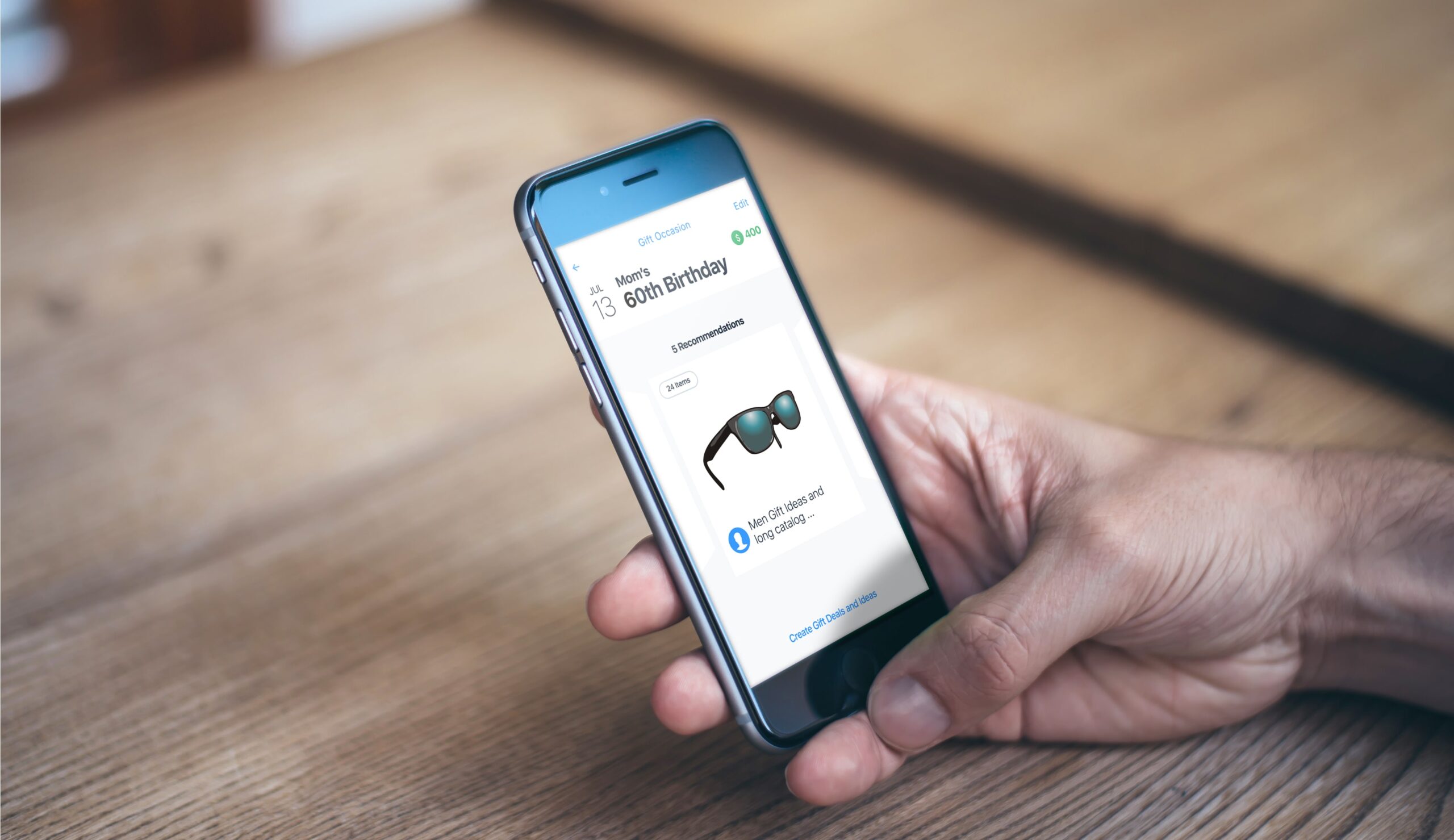
Human assistant and artificial intelligence, all together.
We created Ari, an AI bot, to assist personal shoppers. During development, discussions arose about the possibilities and limitations of AI vs human assistants. AI has access to unlimited data and can make more recommendations, but it lacks emotional intelligence. Ultimately, the human element is more powerful in building strong, meaningful relationships with personal shoppers.
THE REALITY
Relationships in the stores
To create a digital experience all about personal relationships, you first have to understand how they form and exist in real life. Sears has about 1,200 physical stores across the US where people are frequently buying products, getting services and making connections with sale associates. Especially in smaller communities where people rely on these stores, customers naturally form close relationships with sale associates. The sales associate’s job is to serve people in the store and to encourage customers to download the app so they can assign them to a nearby Personal Shopper who will later offer their personal shopping assistant. Sears believes that forming personal relationships like those can leverage the potential to develop more meaningful relationships with customers, making them loyal to you.
THE DISCOVERY
Insights from Customers and Personal Shoppers
Communicating purchase requests Customers making purchase requests are using text conversations or phone calls to communicate with their Personal Shopper instead of creating a new request in the app.
I'll know it when I see it Customers sometimes don't know what they want and might have a better idea after browsing products, categories or what other people like.
Recommendations in one place Customers expect the Personal Shoppers to provide them with recommendations in one single place where they can rate if they like or dislike a recommendation given to them.
Saving time on knowing what customers want A single Personal Shopper’s job is to serve up to 500 clients. To serve so many clients efficiently, Personal Shoppers want to reduce time reaching out and setting up expectations with each client.
the approach
Launch, Learn, Iterate
We were tasked to develop the new experience while taking into account existing functionalities. From a UX standpoint, it was a big challenge. I had to ensure even the tiniest element I wanted to eliminate or improve was always backed up by strong arguments of “why”. Additionally, I had to predict how this change affect other areas in the app. We were given one month to deliver the new experience for iOS and Android. We had three weekly sprints followed by a one week staging environment deployment prior to release of the final version. I knew one month is a very short time to explore at least two different UX approaches, three or four design options, create all the flows in hifi's, craft animations, get buy-in from developers and leadership, and support the implementations for iOS and Android!
the service
Introducing the new Personal Shopper experience
The Personal Shopper app lets anyone call-in a shopping request and get personal attention and service from a Personal Shopper agent who will help them locate their desired product anytime and anywhere.
Call-in a shopping request
Customers can easily call-in a shopping request, and the personal shopper gets the most important information about it.
Select from product ideas and interact with the personal shopper
Customers can give the personal shopper a better idea of what they are looking for by selecting from product categories and interact on recommendations
THE FRAMEWORK
How we got there
The biggest challenge I faced throughout this project was collaborating with the design team. Balancing their feedback and viewpoints whilst moving forward with design took an incredible amount of energy. We wanted to create a simple and intuitive experience that will help customers call in their shopping requests quickly and more effectively, allowing them to receive and iterate on purchase recommendations given by their personal shoppers. We identified two objectives that helped us develop the new experience: Conversational UX, and Content Prioritization.
Conversational UX
A conversational UX design approach enabled us to develop human-like conversations that feel more natural and authentic.
We mimicked a conversation such as:
Me: “Hey, what are you looking for?”
Product Manager: “I am looking to buy a gift for my mom’s birthday”
Me: “Congratulations! How old she will be?”
Product Manager: “It’s her 40th birthday”
We used this approach to cover the different scenarios of people using the app. After, we put together documentation containing the conversational scripts for each scenario. This technique helped us to create the main user flows.
Content Prioritization
I put together a spreadsheet listing all the existing data points and
started a discussion with the team about the importance and meaning of each one for the customer.
After a couple of discussions we finally agreed on the prioritization order and I started the sketching part of the main user flows.
“The biggest challenge I faced throughout this project was collaborating with the design team. Balancing their feedback and viewpoints whilst moving-forward-with design took an incredible amount of energy"
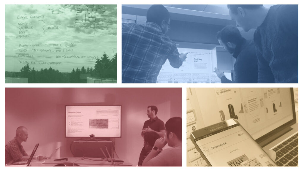
Failing early
Sketching the experience with pen and paper was a crucial step because it helped me identify issues early in the process. I wanted both frontend and backend teams to be involved as early as possible to hear their overall feedback. This assured the proposed app design was feasible when considering timelines and development needs. My goal was to anticipate any potential red flags which might be risky for user experience or meeting deadlines before presenting leadership with the app experience. This was a valuable, time-saving step. For example, I discovered importing contacts from user’s phone to the app would require more investigation and development time, so we decided to exclude it in the first iteration. With the rapid sketching iterations, I was able to get buy-in from leadership on the happy path and quickly turned over to creating detailed wireframes.

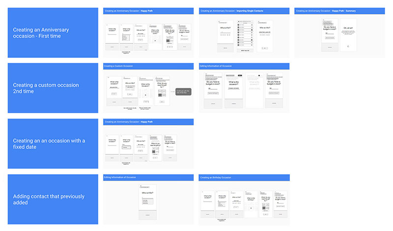
Covering every possible flow
This is where things got a little tricker. I created functional wireframes to cover all the possible use cases, from downloading the app to installing it, connecting to a Personal Shopper, call-in a shopping request, interacting on recommendation, editing and deleting a request, empty pages and many others. The main challenges I faced throughout this phase were: to ensure content was consistent across all flows; no holes in the user experiences; development and design teams were aligned with every single page, component or behaviour; and finally present it to leadership for approval.
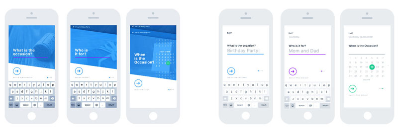
Visual exploration
Many designers save time by cutting back on designing the best possible looking UI, with the argument of learning customers first. I fundamentally believe visual exploration is a vital step for achieving an amazing user experience - especially in today’s world. There are countless great apps and services out there so it’s vital to meet the highest standards and look at least as good as your competitors, if not better. I used prototyping tools to ‘feel’ the different design versions. When I find the one that works the best, I consider all the advantages and disadvantages on why it should be the one we move forwards with. Of Course I also get the design team involved during the selection process by hearing their thoughts and opinions on all versions.
Implementing the “impossible”
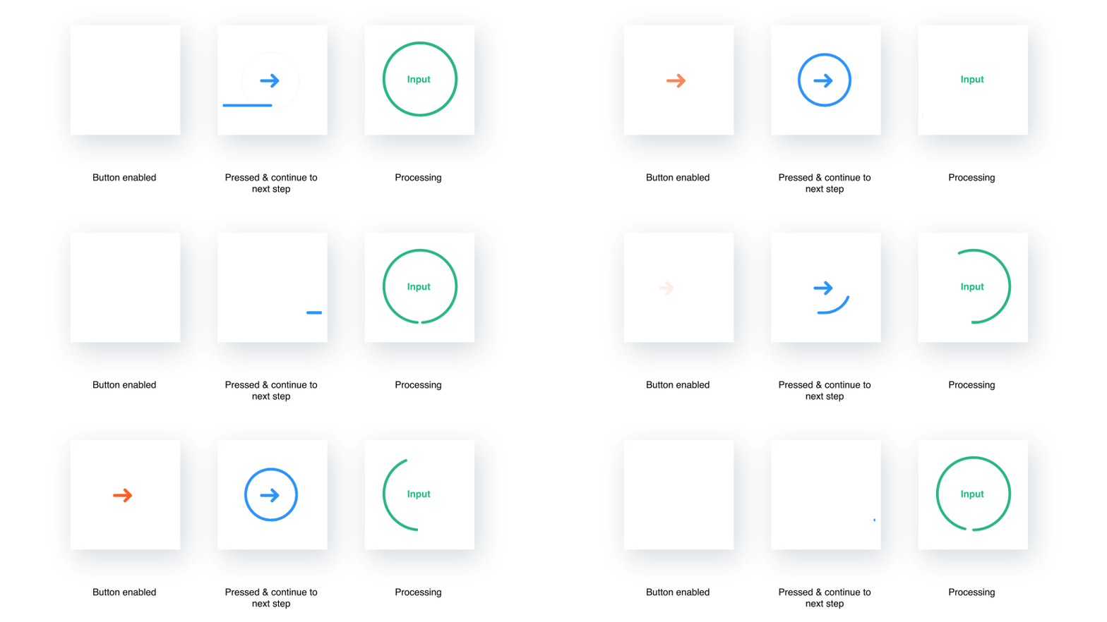
When I created the animations in After Effects, I already identified some of the challenges to make it a reality. For example, challenges from a UX perspective included strong arguments to justify the importance of motions and how they help the user in the experience. Another challenge was more technical. I needed a solution to support the implementation of the animations so it both quick to develop, easy to modify and accurate to the original design. I managed to change developers estimation from: “impossible in two weeks!”, to “Possible… maybe, but only if...” to “Ok, let me work on it.” I used an After Effect plugin to convert motion to iOS code. It wasn't perfect at its job, but it helped developers get an idea of how to create the motion using code other than PNG sequence or a video file.
IMPACT
From day one!
- The app has seen rapid growth in shopping requests from customers
- One-on-one conversations with users showed that the majority had a significantly improved experience with the app
- The new app experience allows for more personal, meaningful interactions between personal shoppers and customers
