Walgreens Boots Alliance
Next-gen pharmaceutical app
Overview
Walgreens' initiative to redesign its IC+ computer system, used by pharmacists and technicians to serve patients, presented many interesting UX challenges. This case study covers the patient registration aspect of the project, which was one of two discovery design efforts I worked on at Walgreens. The other effort focused on the patient search experience.
Services
Discovery, Wireframes, Journey Mapping,, Prototyping Design, Content Management
TEAM
UX lead | Product Manager | Project Manager UX Researcher | Business Analyst | Visual Designer
PROJECT TIMELINE
9 months
PRODUCT
Internal web application (web and tablet)
Categories
Healthcare | Desktop Application | B2B | Retail
Patient registration discovery
A digital experience designed for pharmacists and technicians to deliver patient safety and efficiency
The big picture
Medical errors are, according to a 2016 article in the British Medical Journal, the third leading cause of death in the United States, just behind heart disease and cancer. While the causes of medical errors may be numerous, it is likely that errors caused by the interaction between humans and computer software play a significant role in reducing the number of errors and promoting better patient safety.
Challanges
Design a next-generation, streamlined digital experience for pharmacists and technicians to quickly and easily look up patients in the system, register new ones, and input prescriptions, all while promoting better patient safety.
Approach
In conducting my discovery work, I balanced two key elements: using existing user research findings as a foundation, and using big-picture thinking to drive creativity and innovation in envisioning the future of pharmacy software.
research phase
Constant learnings
Legacy system training sessions
Learning about the tool, reading manuals, watching videos, and playing around with the actual software almost every day.
Research documents
Consulting work involved reading through research findings documents from usability testing and user interviews to gain a deep understanding of user behavior and needs.
In-store observations
Visiting a physical Walgreens pharmacy and observing the daily operations of the workers was another important aspect of the research.
Teams & Business research
Meeting with and interviewing designers and stakeholders significantly enhanced our understanding by providing missing information and additional context.
Research Phase
Identifying important key questions
While finding answers to important questions takes time and effort, it is equally crucial to identify the right questions to ask and build a team consensus around them.
Patient
Customer
What are they trying to accomplish and why?
How are they doing it today?
What are users' problems, delights, and frustrations and how are they currently addressing these issues?
DESIGN phase
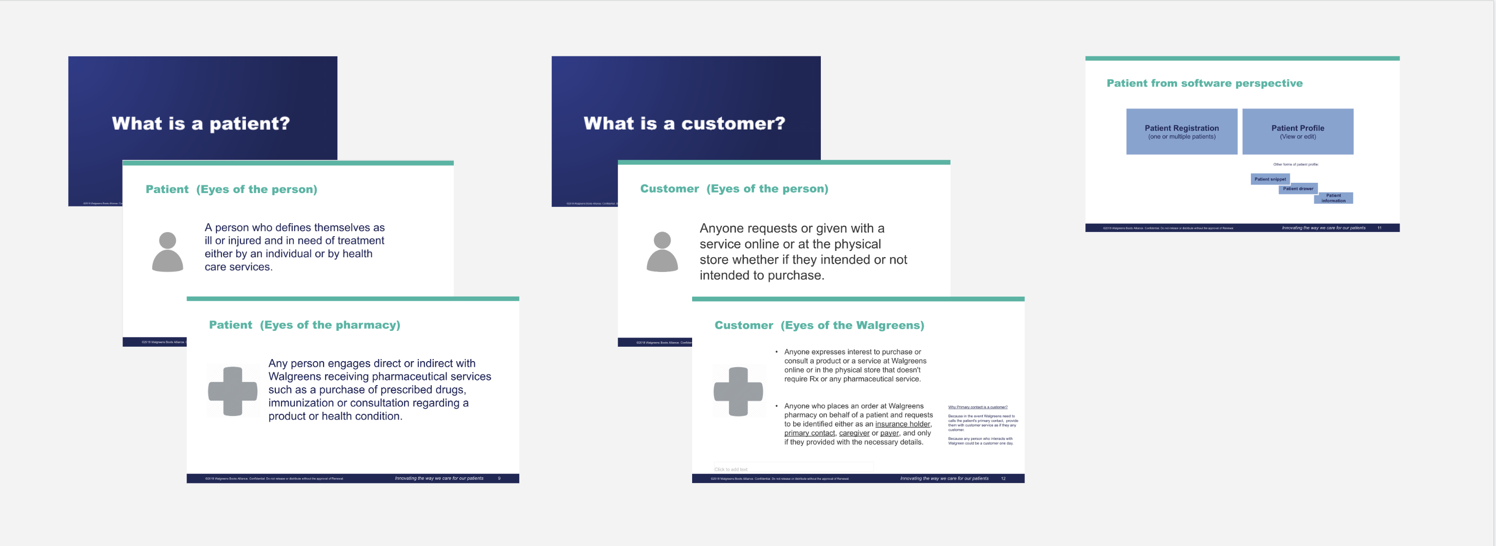
Terms & definitions
This was an excellent design exercise that greatly contributed to gaining team consensus. It revealed the gaps and patterns in how team members think, view, and define concepts such as "patient" versus "customer" and the meaning of "patient safety." Creating a document with basic terms and definitions that most team members agreed on was sufficient to move on to the next step.
DESIGN phase
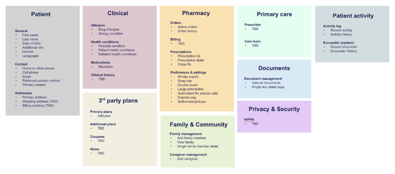
Organizing the content building blocks
DESIGN phase
Layout mapping
Designing the screen layouts involved incorporating the decisions made in the previous design iteration, including the building blocks, content hierarchy, and design decisions backed by user studies.
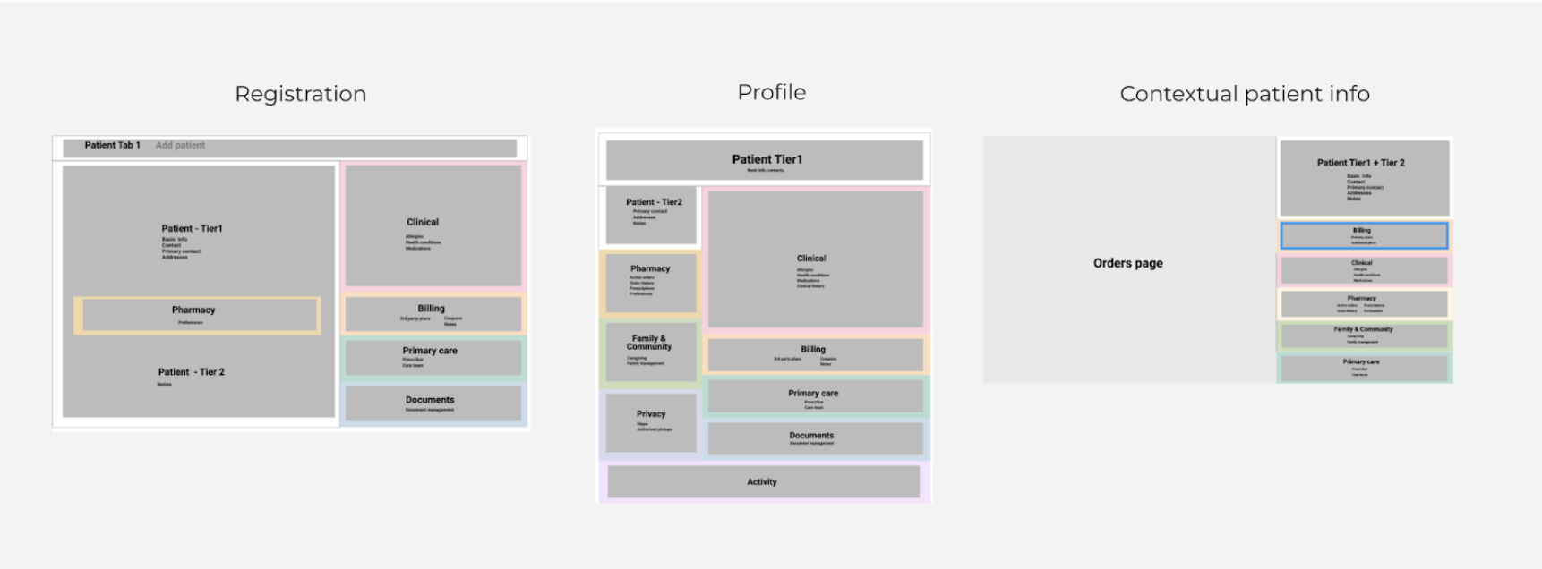
Key design decision based on research: Users want to avoid scrolling when viewing patient information. To meet this need, we need to design a concise display that can surface more information, yet be flexible enough to allow users to add new patient information.
DESIGN phase
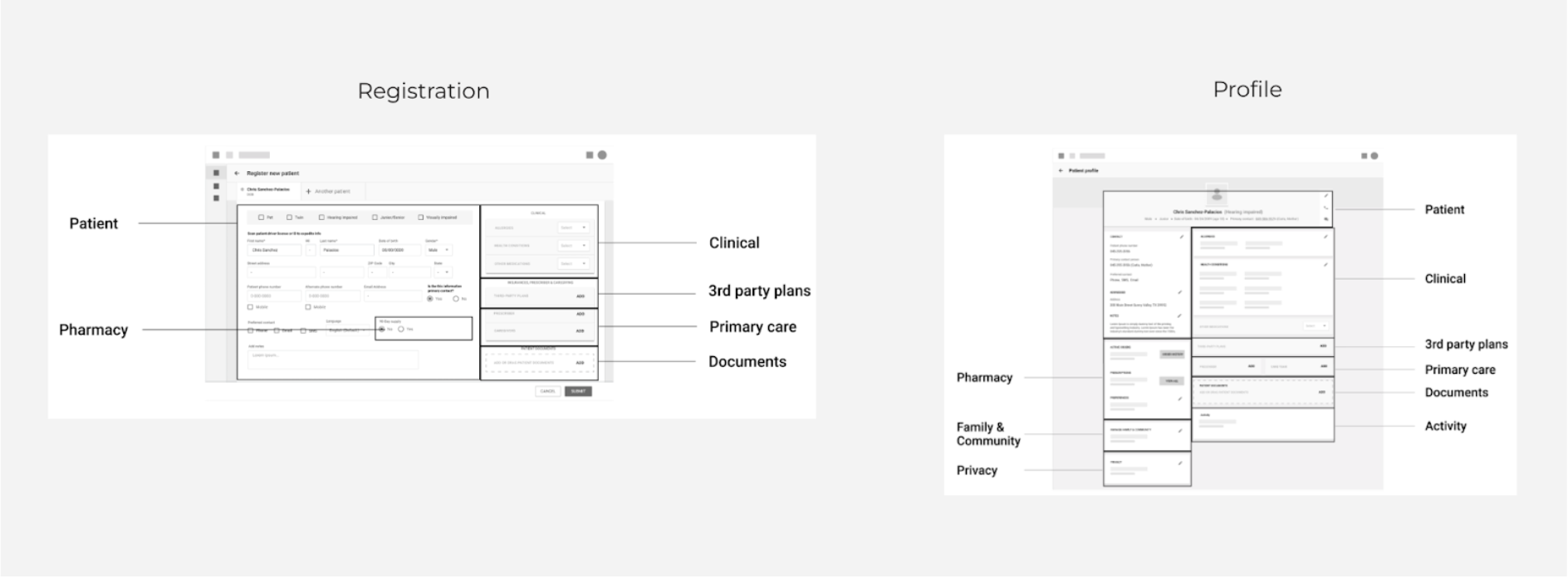
Functional wireframes
I began creating functional wireframes that reflect user interactions and UI components.
DESIGN phase
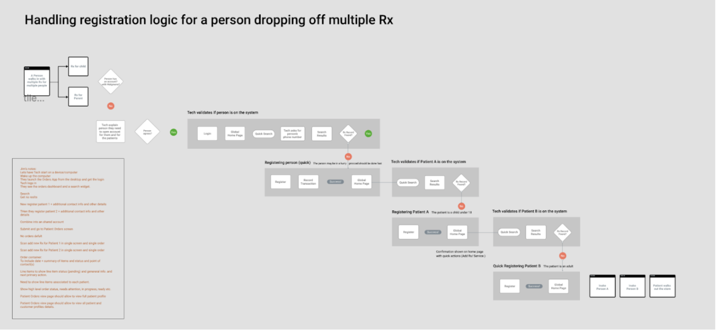
Validating operational workflows with POs and PMs
Before mapping out the various user flows, it was helpful to validate the logic and accuracy of the new proposed core workflows and identify any gaps.
DESIGN phase
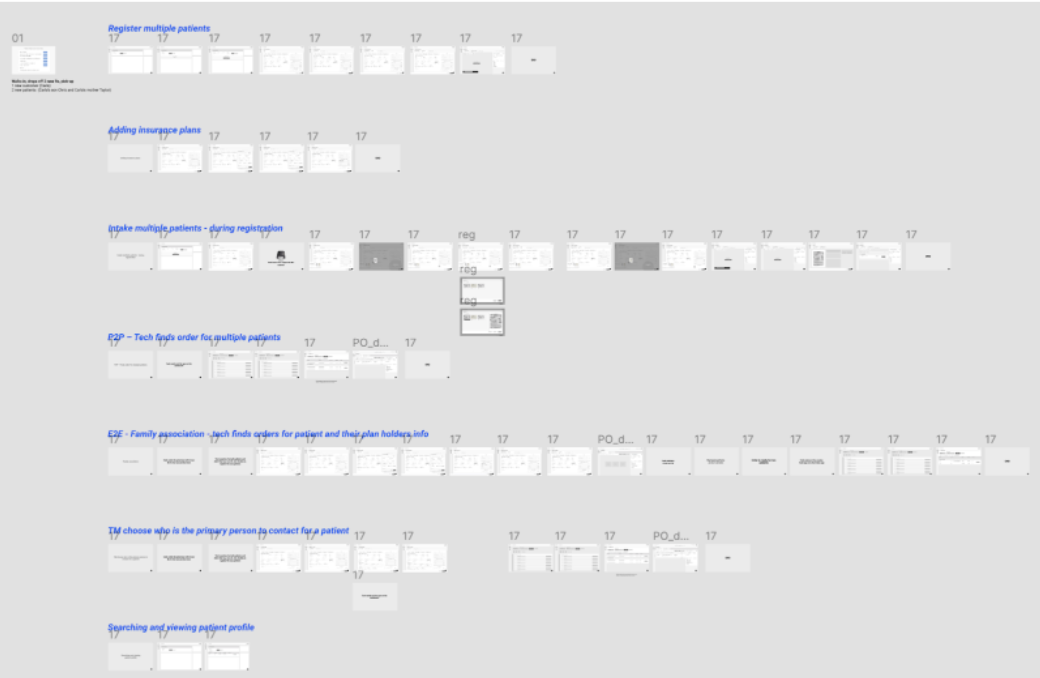
Mapping the user flows
The goal was to map out all the major workflows for users to handle the intake of one or multiple patients, register one or multiple patients, fill in information, and complete fulfillment.
TESTING phase
Running moderated testing with real users
We tested our assumptions by presenting designs to real users and soliciting their feedback. We discussed the study goals and research methodology, and then began working on a prototype for testing. Our UX researcher scheduled 1:1 sessions with users to collect feedback. After the sessions, the researcher shared a summary of the findings and additional information to help us move the design forward. We continued to validate design decisions through multiple rounds of testing and refining until we fully fleshed out the user flows.
Learning Phase
Outcome
Synthesizing finding after testing sessions
We learned new things in almost every testing session by watching the recorded videos. The winning designs were the ones that we continued to evolve and build upon
Product meetings
We scheduled time with product owners to review the study findings and discuss which features should be included in the MVP and which should be excluded. These meetings were crucial for building alignment within the team about which designs to move forward with and which to archive.
