foundant
Multi-Brand Design Systen

Overview
Foundant is a key player in the grant management application space for nonprofits and community foundations. Like many companies, they developed three different software solutions with little focus on UX or consistent standards, resulting in a fragmented user experience. In this case study, I showcase how I built a unified, multi-brand design system that serves all three applications—delivering a cohesive, modern, and scalable UX.
role
Lead Product Designer
Team
Our team consisted of one lead engineer, five software engineers, and three product owners from different product teams
Core Problem
Over the past decade, Foundant’s suite of grant management applications—including Grand Hub, Pro C-Suite, GLM, and SLM—was developed at a time when UX consistency was not a primary focus. As a result, each product evolved with its own distinct UI framework leading to significant challenges:
Fragmented User Experience
Users encounter vastly different look and feel across products. This disjointed experience creates trust issues, as clients struggle to feel they’re engaging with the same company’s ecosystem.
Growth & Transition Difficulties
Many non-profits start with one application and later expand to other solutions as they grow. The inconsistency between products makes this transition cumbersome, reducing overall customer satisfaction and loyalty.
Outdated UX Practices
Several products do not align with modern UX standards, making them feel outdated and hindering user adoption.
Development Challenges
Without a standardized design framework, developers inadvertently introduce further inconsistencies with each new component, complicating maintenance and innovation.
My Vision
A Unified Design System
I knew we needed a cohesive design system—a single repository that could bring together all our products while still respecting each product’s unique identity. My goal was simple: create an environment where every interaction felt familiar, modern, and accessible, no matter which application a user was engaging with.
The Strategy
How to get there?
Below is the strategic blueprint I mapped out—a set of tactical pillars that I want the company and our engineering teams to follow to build a unified, multi-brand design system:
Step 1
Global Style & UI Framework
This was a foundational tactical step—I wanted the company to align on two key things: a single UI framework that every team would use and a unified global style guide. The framework would provide consistency across all products, while the global stylesheet would define the foundational path for typography, iconography, and color usage, ensuring a cohesive and scalable design system.
Step 2
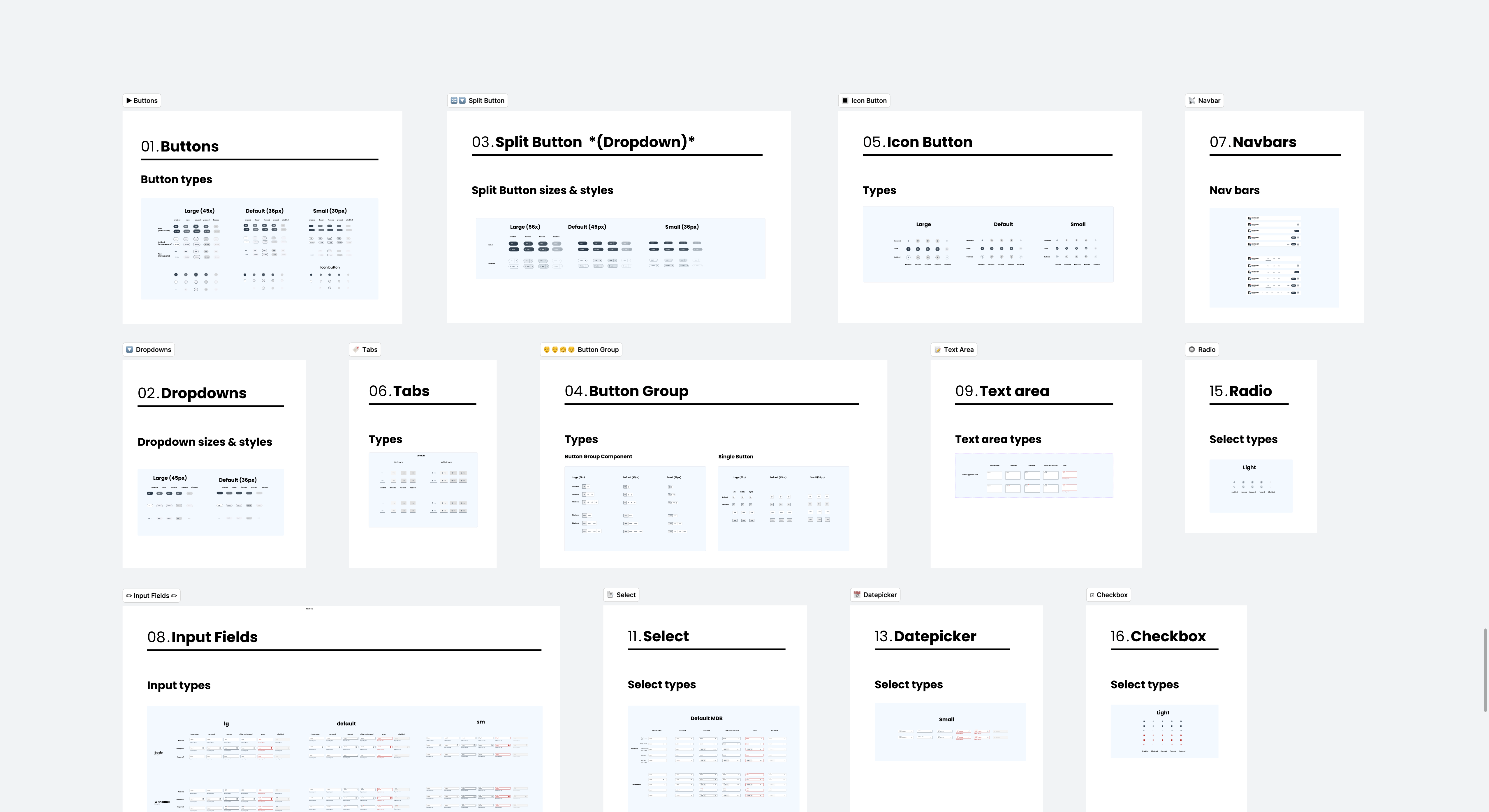
Establish Component Ecosystem
Once there’s a global stylesheet and framework agreed upon, we need to create a simple Figma file called Foundant Design System. It includes the most essential components—buttons, hyperlinks, dropdowns—serving as a clear source of truth for designers and developers. The focus is on the basics first, keeping it simple and accessible. While atomic design was considered, this step is about assembling foundational elements to align everyone before expanding further.
Step 3
Live Repository of UI Components
A Figma library alone wasn’t enough—we also needed a live repository of components that developers and designers could reference in real-time. This would allow teams to see exactly which UI elements were available, properly documented, and ready for use across different products. More importantly, this step set the stage for tokenization, where we could begin linking design elements (like colors, spacing, and typography) directly to code.
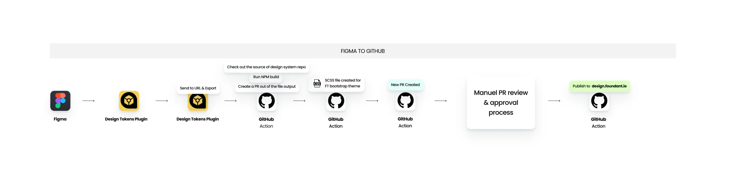
Step 4
Figma-to-Production Pipeline
At this step, my goal was to enable designers to deploy design changes directly to the repository and see updates in real time. This meant strengthening our tokenization system while driving discussions on Figma-to-code integration. I wanted tokens to be more than just structured data—I wanted designers to see them in action. By setting up this workflow, designers could act as gatekeepers, ensuring that updates to components flowed seamlessly from design to development without manual intervention. This was a key step in making the design system truly scalable and dynamic.
Communicating the “Why”
Ensures consistent design across all part of the products.
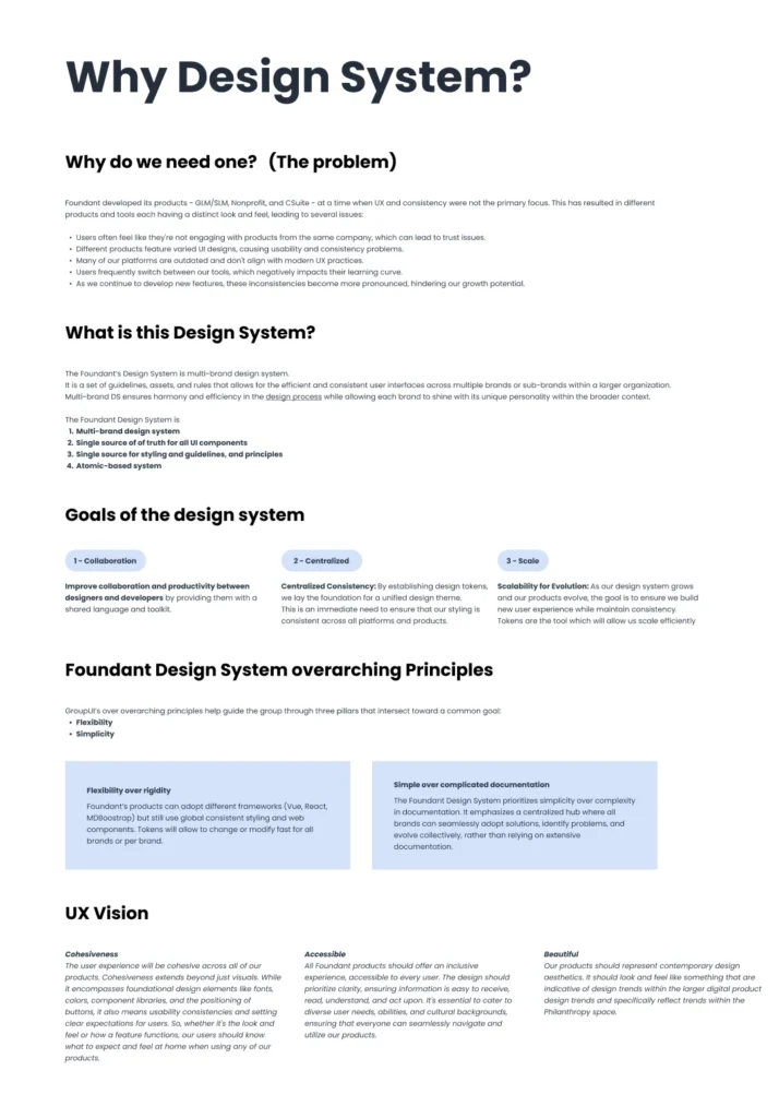

Global Stylesheet
Ensures consistent design across all part of the products.
Figma to Staging
That milestone unlocked multiple capabilities and led to interesting discussions on gatekeeping
business and user impact
🎉
Results
The Design System is always evolving, and it’s exciting to see its functions take shape.
Unified Collaboration
Four teams across the company—using frameworks like Bootstrap, Vue, etc.—shifted from working independently to implementing new UI components from one single source of truth.
Global Style Implementation
A comprehensive global stylesheet was implemented and reflected in new pages built for real-time testing, ensuring design consistency.
Adoption in New Features
New features developed company-wide now utilize the foundational components, such as buttons and dropdowns, established in the design system.
Streamlined Updates
With the global stylesheet and tokenization system in place, designers and developers can easily modify and see updates instantly, enhancing collaboration and efficiency.